Newsome Academy
School logo identity including exterior signage
Traditional looking high school brand with the use of a shield and symbols related to school. The only problem is no one knew what the symbols stand for. The castle represents Castle Hill / Victoria Tower. However, the squirrel and sheep had lost their identity.
An Academy logo should represent the Academy, have a meaning, and be instantly recognisable. Print Bureau aimed to modernise the current logo for Newsome Academy and create a more meaningful brand.
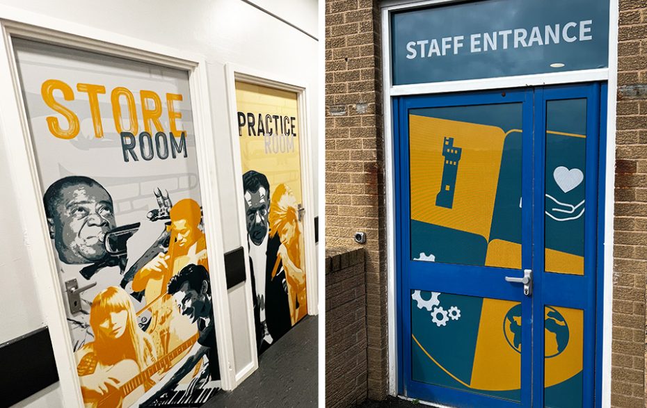
With the image of the shield the team created symbols that represented the Academies values: Castle Hill the school's heritage to represent ‘Respect’, a hand holding a heart to represent ‘Integrity’, Cogs to symbolise ‘Teamwork’ and the world to reflect ‘Aspiration’. The shield can be dissected into four individual shields for each of the values.
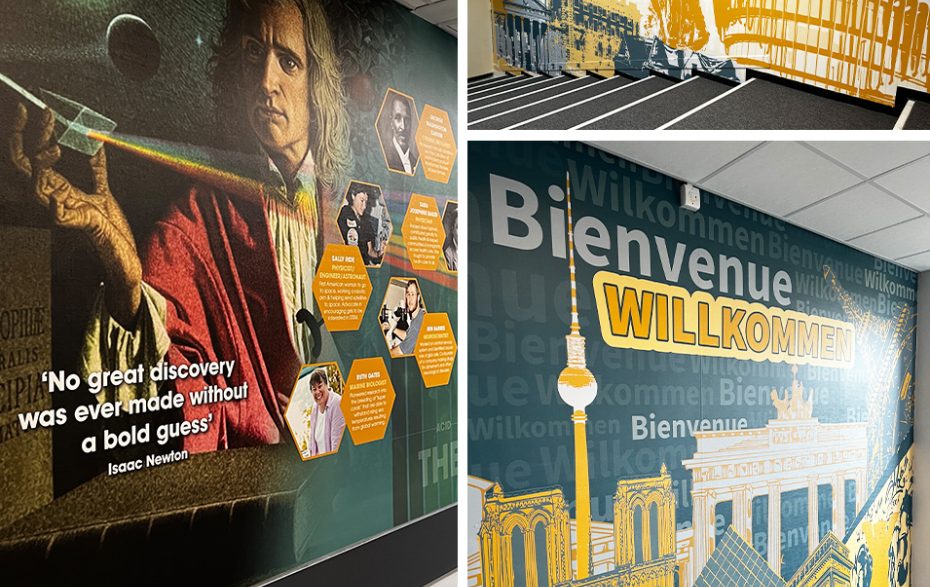
The science wall's aim was to be used as a talking point for students and visitors allowing the audience to learn and interact with the wall. The ‘STEM-inism’ wall was designed to celebrate women who have careers in STEM areas and to encourage female pupils to get involved in STEM-based careers. The second element of the science area was a timeline of scientific discoveries, this was combined with elements from the Academies Science-based curriculum.
All wall art was designed, printed, and installed by the Print Bureau team.
Print bureau have supported us and guided us in a full rebrand of our school identity and relaunch of our vision, mission and values. Creative approaches with a modern twist have started to bring the school to life and created an environment all stakeholders can be proud of. We will continue to work with Mike and the team to further improve our brand and image across all platforms. Such a friendly and helpful team with a personal approach to meeting and surpassing or needs and expectations.
Joel Hinchliffe, Assistant Headteacher
ARE YOU READY TO MOVE YOUR SCHOOL FORWARD


