LOGO DESIGN, BRANDING & PRINT
Our design services for schools offers logo design, branding, print, and signage unique to the education sector. We specialise in logo design and branding to ensure schools have a refined, functional, and unique design.
First and foremost we invest our time by working with schools via consultations to create design solutions tailored to your school
and core goals.
Our design for schools services cover:
We specialise in logo design and branding to ensure schools have a refined, functional, and unique design.
If your school needs a refresh, start your personalised school consultation by contacting the team below!
SCHOOL PROJECTS
CROSS LANE PRIMARY SCHOOL
Print Bureau worked with Head Teacher Mark Sharp
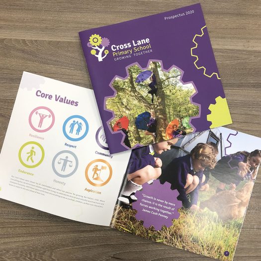
to create a new logo design for Cross Lane Primary School. The tree and the cogs within logo represents the schools strap line of ‘Growing Together’.
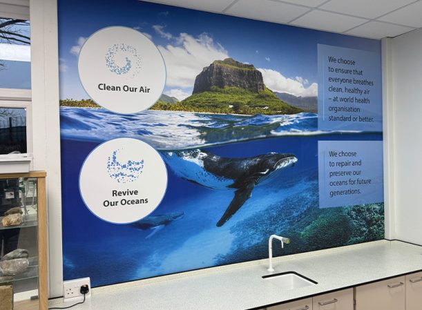
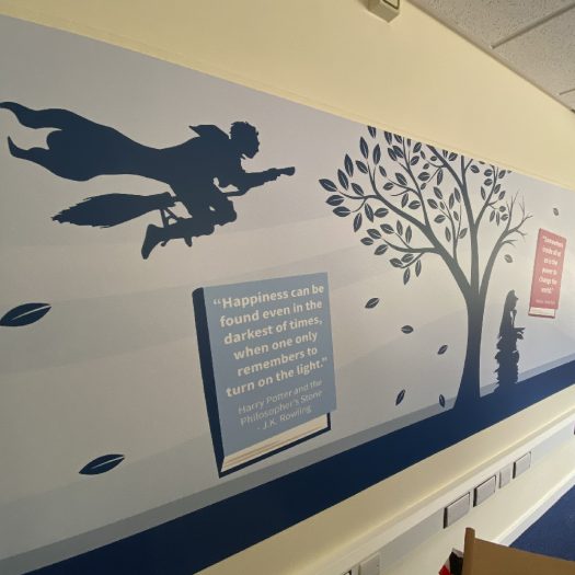
The design team created also infographics to support the school’s core values. The infographics have been used across the school within student planners and printed wallpaper.
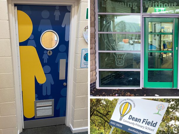
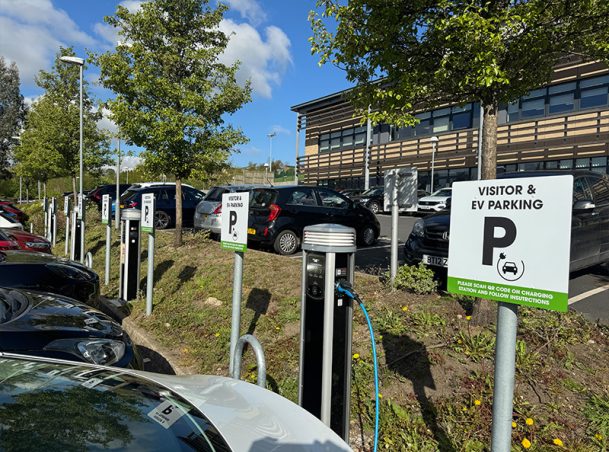
Cross Lane Primary School also had their indoor and out signage designed and printed by the Print Bureau team.
Additionally a virtual video was created for Cross Lane Primary which can be viewed here
IMPACT ACADEMY TRUST
The team has been working with Impact Education Academy Trust with design consultations for the trusts Academies.
Together with Impact, we aim to create a better future for current and future Academies and their pupils.
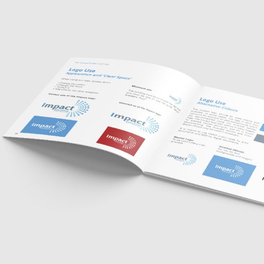
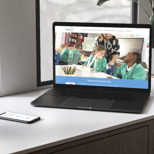
Furthermore, Print Bureau has also supported and helped the Impact Academy Trust brand identity. Ensuring their logo and branding are consistent through stationary, documentation, and website.
Visit the Impact website here
OLD BANK ACADEMY
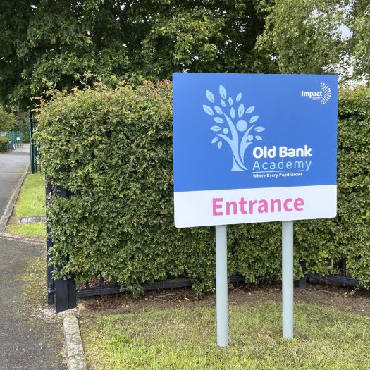
Judy Woods, Head at Old Bank Academy worked with the Print Bureau team to recreate the school’s brand identity.
We created schools brand, signage, uniform, print materials and website.
The tree symbol made from people figures, represents the pupil’s growth throughout the school and promotes the strap-line of; Where Every Pupil Grows.
The use of vibrant colours within the brand is to reflect a brighter future for their pupils. With a modern feel to the logo so pupils feel proud to
wear the logo and be a part of the school.
Please take a look at Old Bank Academy website here
HILL VIEW ACADEMY
Hill View Academy had lost its vision as a school.
Print Bureau aimed to completely re-design the school’s ethos and values.
Furthermore, to restructure and build back the relationship it once had within the community.
By investigating Maslow’s Hierarchy of needs theory, the team extracted elements to help develop the
ethos and values.
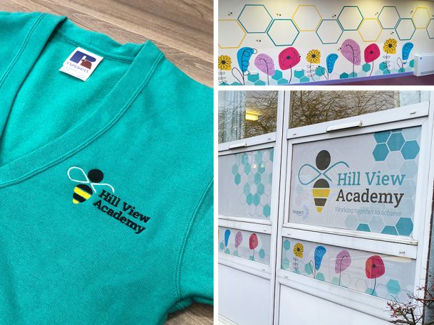
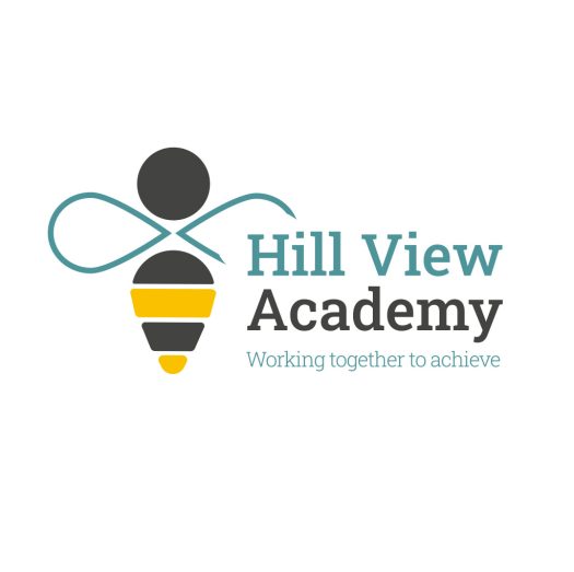
The team created a bee logo design to reflect a strong vision and represent a modern and meaningful message. The symbol of the bee highlights the value of working and helping one another as a team.
Take a look at Hill View Academy here
WARLEY ROAD PRIMARY ACADEMY
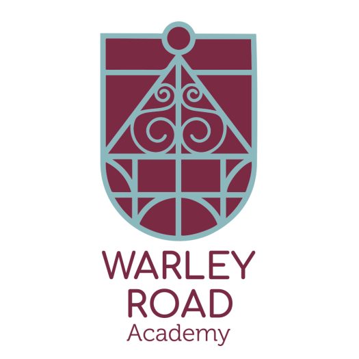
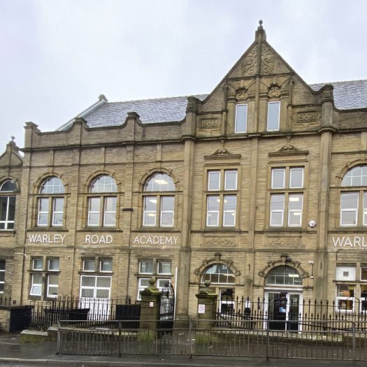
Warley Road Primary Academy Headteacher Lesley Heathcote felt the school's logo had no meaning to the school. In addition to this, Lesley wanted her pupils to have something they felt proud of and a logo to represent the heritage.
The logo design focused on the architectural elements of the building as well as the grandeur and heritage of the school's existence.
Additionally, Print Bureau also supported the brand throughout the school with the design and print of the school's signage.


